To test logo designs, show two logos to people who haven't seen them, ask one question about one quality, and look at how their choices split. Ask about trust, recognition or fit. Don't ask which they like best and treat that as a verdict on the design.
Your team knows the brief and has seen every draft. People outside don't, which is why they are worth asking.
Why not ask your team
Your team has three biases that outside people don't share:
- they know what the logo is meant to say;
- they have watched the drafts change and are attached to some;
- they judge it against the brief, not against the other logos a customer sees.
An outside group sees the logo cold, the way a customer will.
What to ask about
Pick one quality. Each is a different question:
| Quality | Example question |
|---|---|
| Trust | Which logo looks more trustworthy for a savings app? |
| Category fit | Which logo looks like it belongs to a savings app? |
| Clarity | Which logo is easier to read at a glance? |
| Stand-out | Which logo would you notice first on a shelf of similar ones? |
| First impression | Which logo do you prefer? |
"Which do you prefer?" is the weakest. It is fine as a first look. It is a poor basis for a decision.
How to run the test
- Prepare two logos as images. Use the same size, background and framing for both. A difference in presentation will decide the result for you.
- Write one neutral question for one quality. See how to write a question that does not lead people.
- Use an A or B images question. Heads, the people who answer questions on 50heads, tap one of two pictures. Images add $0.10 an answer each, and the estimator shows the total before you ask.
- Add "Neither" if both could fail. It shows in gray in the results.
- Choose who answers. If the logo is for a particular group, target that group. Each trait adds $0.05 an answer.
- Ask fifty to start. Fifty Tier 1 answers to a short question cost $13 before images and typically take about ten minutes. Tier 1 means each person has a verified phone.
If you have more than two logos
A or B takes exactly two images. For three or four designs, run the pairs and keep the winners. Compare two, drop the clear loser, then bring in the next design against the winner.
Don't test six at once and read the order as a ranking. Each extra option spreads the answers thinner.
A worked example
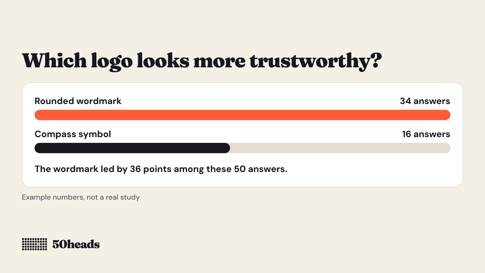
You have two logos for a savings app, one a rounded wordmark and one a compass symbol. You ask fifty Tier 1 heads: "Which logo looks more trustworthy for a savings app?"
Say the result is the wordmark 34, the compass 16. The result line says the wordmark led by 36 percentage points among these 50 answers and how strong that lead is for a sample this size.
That tells you which one people picked when asked about trust. It does not tell you the wordmark is the better design.
The numbers in this example are made up to show how to read a result. They are not from a real study.
What a logo test does not tell you
- Preference is not design quality. People may favor the familiar over the distinctive.
- A logo is seen in context. It sits on a product, a website, a shop window. Test it there too.
- Recognition takes time. A cold first look says nothing about whether a logo becomes memorable.
- A different group could choose differently. The result shows what this group chose.
- Don't test other people's brands. Use your own designs, or fictional ones for practice.
Finding out why
Ask 20 Tier 2 heads, who have also passed an ID check, to write a short reason (up to 200 characters). It often explains a split that the numbers alone don't.
Next step
Prepare your two images and see the price first. See pricing and try the estimator. It charges nothing. For the method, read what is preference testing.